L'Avenir
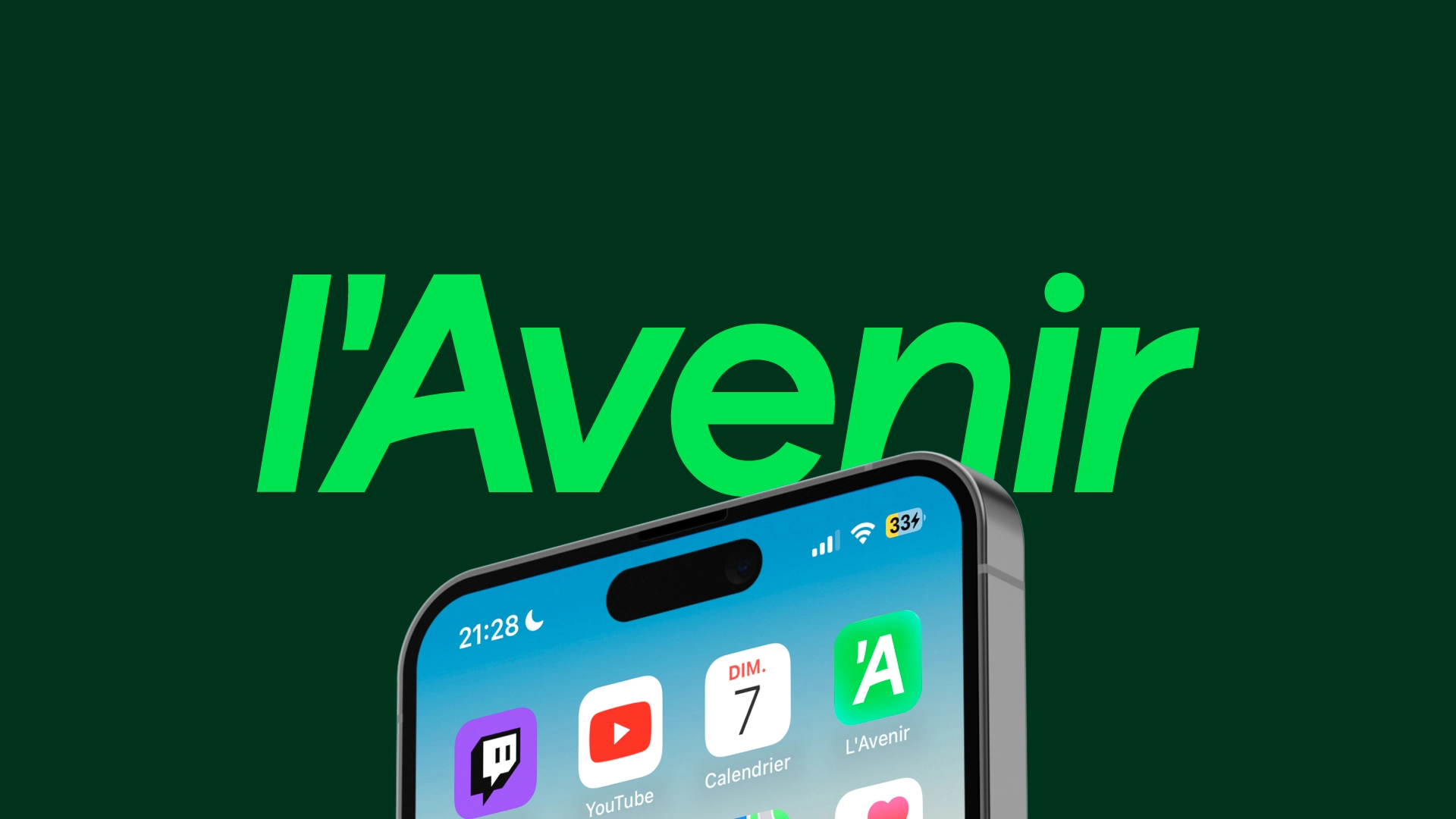
Founded in 1918, L’Avenir is the oldest French-language daily newspaper in Belgium. While it had already undergone some graphic adjustments over the decades, the newspaper needed a real turning point today to better reflect its ambitions and modernisation. We have therefore designed a new visual identity that embodies both its heritage and its future. A logo looking towards the future, ultimately.
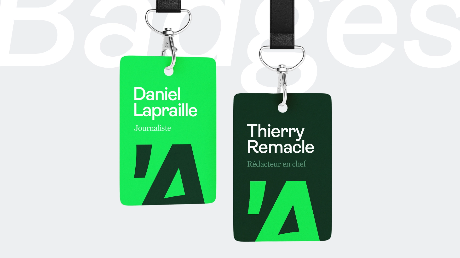
The new logo of L’Avenir is based on a simple, clean and dynamic shape. Tilted at 9.5° to the right, it symbolises momentum and movement.
The apostrophe, which has become the distinctive element of the brand, links its history and its future: a strong, recognisable identity full of energy.
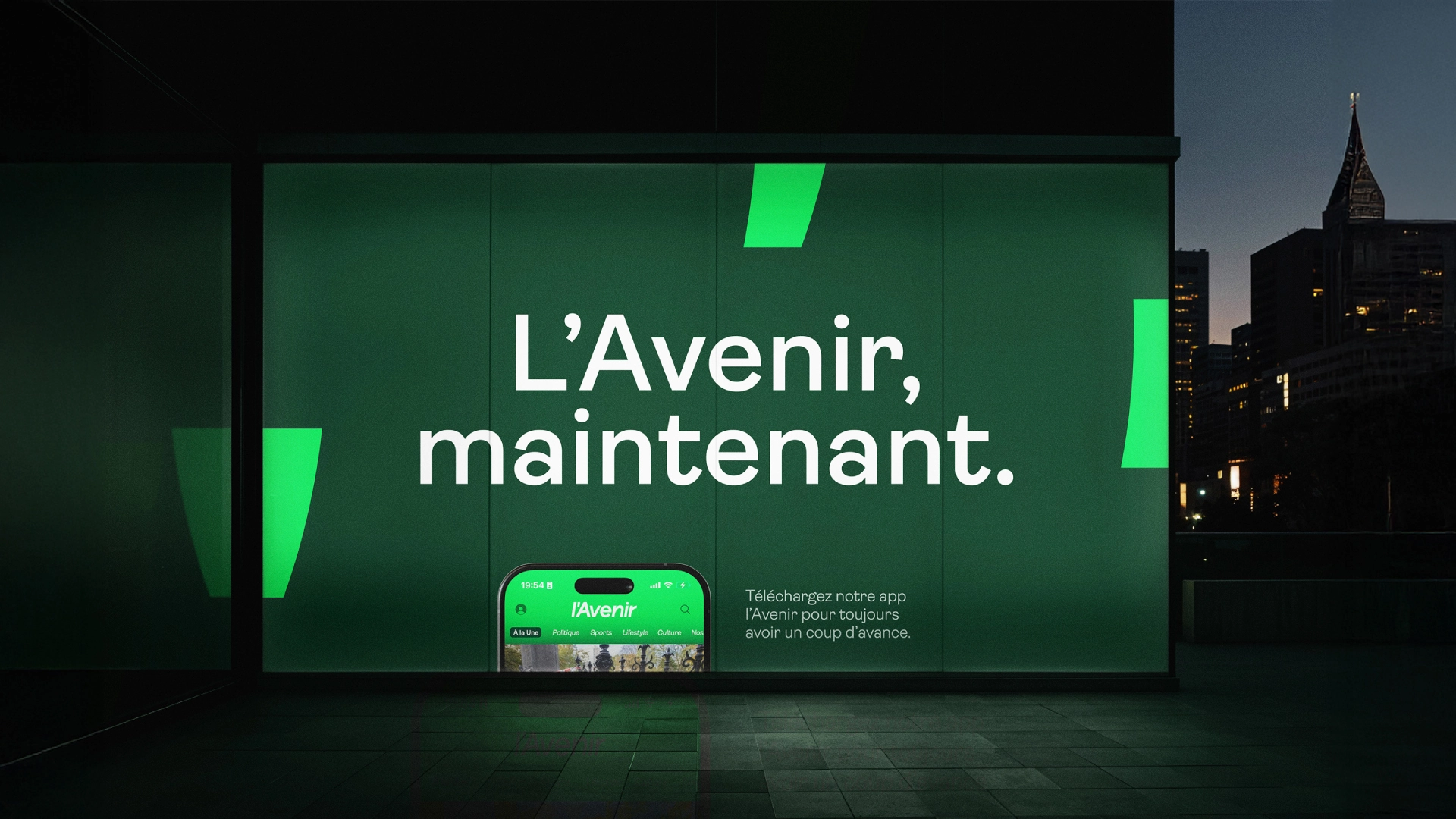
The new palette revolves around two main greens: the "future" green (brighter) and a forest green - accompanied by vibrant secondary colours to enrich the digital universe.
The typography Ambit, with its rounded and dynamic curves, reinforces this sense of positivity and modernity.
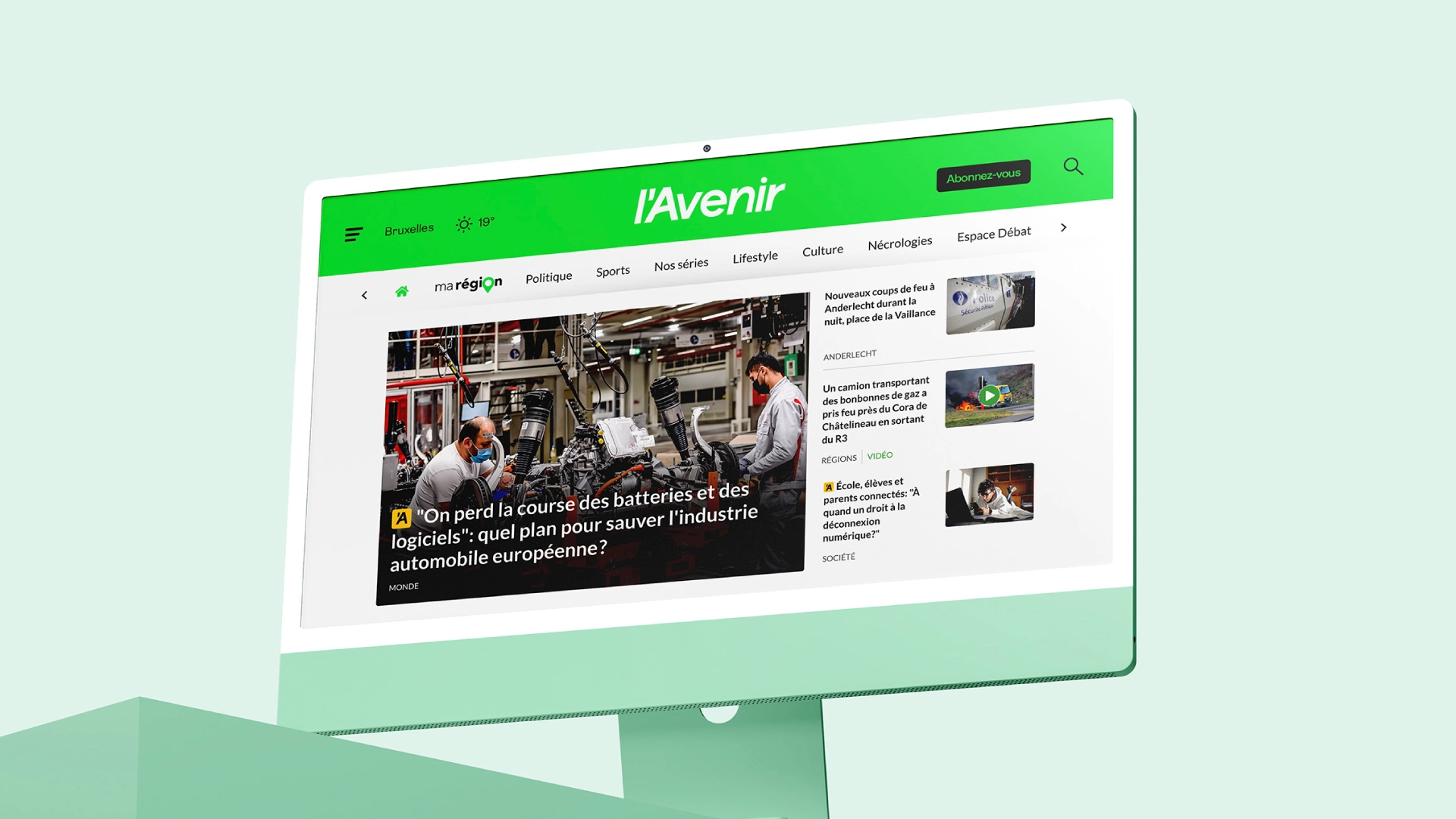
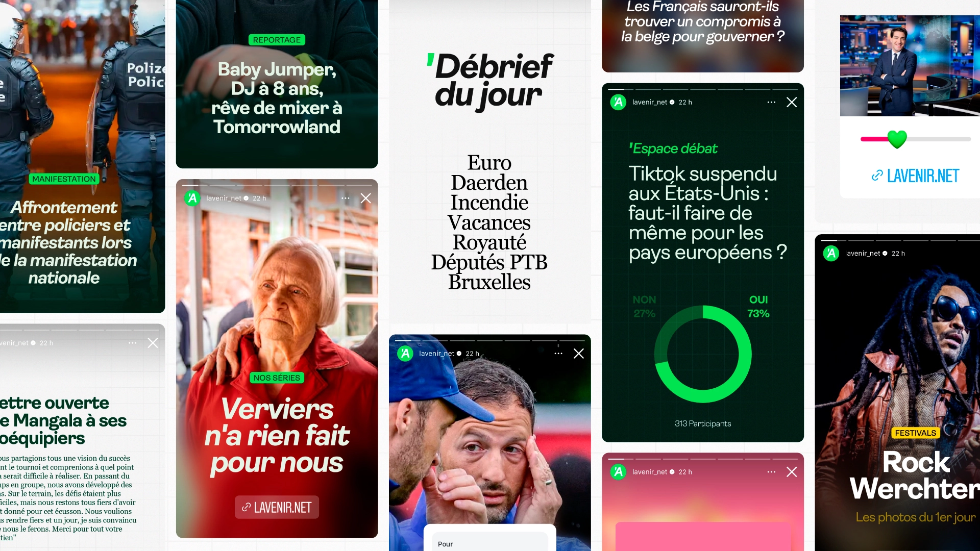
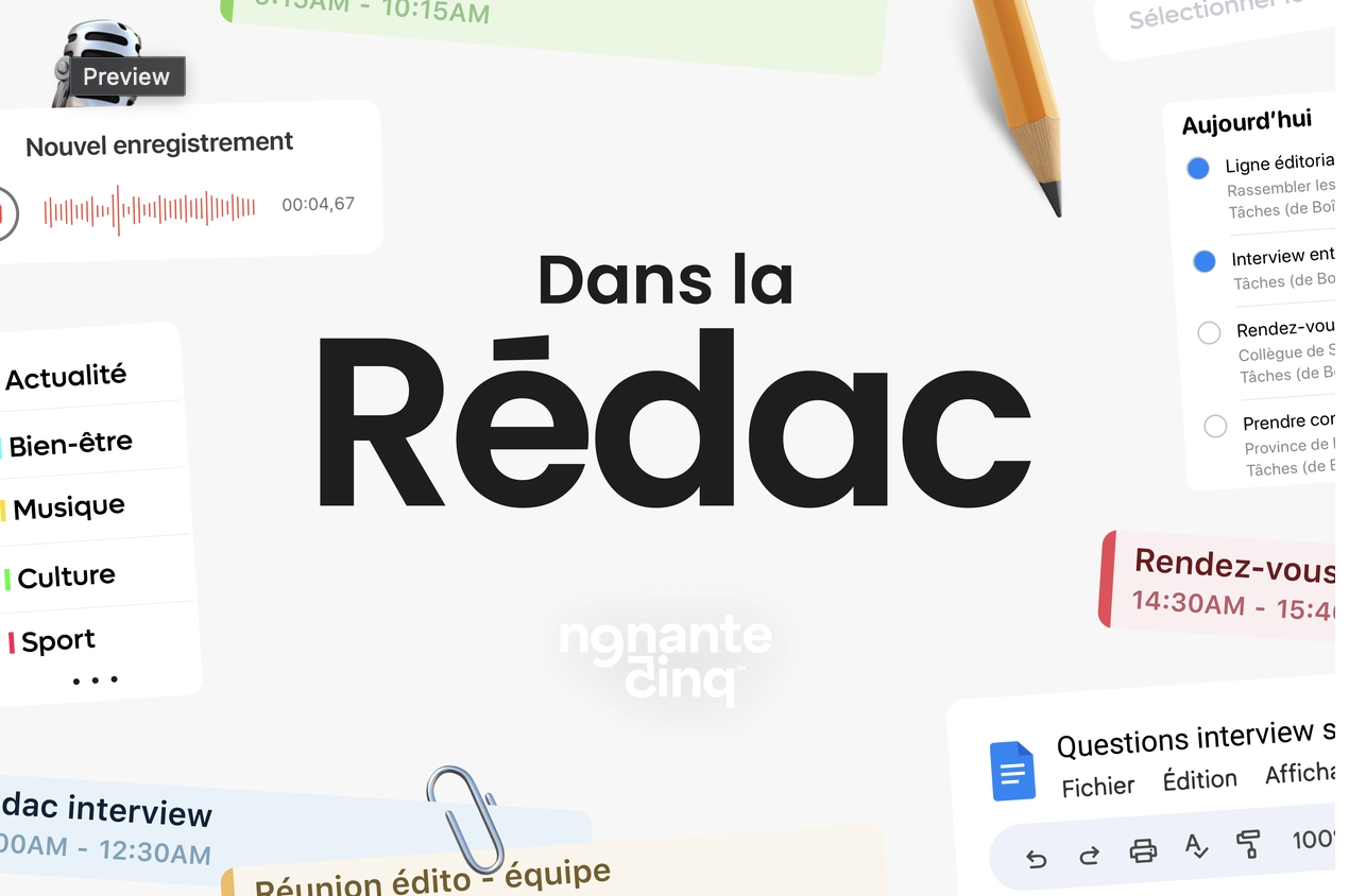
This rebranding marks an important milestone: after more than a century of existence, L’Avenir is adapting its identity to accompany its digitalisation. The design, conceived for both print and the web and social media, ensures graphic coherence across all platforms and provides the media with a more modern and dynamically image.
Klant
L'Avenir
Sector
Media
Categorie
Branding & creativiteit
Begin van de samenwerking
Septembre 2025